ARTS 412
Graphic Design Software II

Elaine Edmondson
I am currently a senior majoring in Graphic Design at Binghamton University.YEET

Project 1: "Riddle Me This" Typographic Riddle Designs
With the rest of class 412, I created "Riddle Me This" a typographic riddle book. The book's general typeface is Futura, and the color palate is composed of red, yellow, blue, green, white, and black. These stylistic guidelines were agreed upon by the class. I encourage you to click on the post's image to review our entire digital book collection of typographic riddles! Let's see how many of them you can get right! Good luck :)

Project 1: It Ch. 2 and 101 Dalmations Final and Progress
For It Ch. 2, I used white and red to colorize my design since those colors were prominent in It Ch. 2's movie poster. I decided to switch the colors of the text and background since the red background from the progress design seemed to clash too much against the general feel of the rest of the book. In addition, I used the white arrow and pen tools in Illustrator to tailor another font to match the typeface used for the movie. As for 101 Dalmations, I used a white background with black different-sized dots to represent a dalmation's fur. I also added a red outline around the text 101 to match the red collar look of the dalmations in the movie. I decided to change the font though to match the general font used in the riddle book, Futura.

Project 1: Front Cover: Final and Progress
The one on the top left is the official cover of "Riddle Me This". The rest shown here are some of the progress designs I created for the cover. All of them show film strips; I wanted to incorporate film strips into the cover because all the riddles designed are about movies. The reason why I chose the design on the top left is because the background colors seemed to match better with the rest of the book's design theme, and I liked how the flat design gave somewhat of a dynamic feel: the filmstrips moving horizontally. As for the text, I decided to make them white to have the title be more legible.

Project 1: Inner Cover: Creators' Names
I decided to create a pattern composed of all the riddle creators' names for the inner cover of the book. I thought it would be fun to use their names as a sort of texture or look. I decided to make the background black which would accentuate the names which are set in the color palate shared with the rest of the riddle book.

Project 1: Other Progress Designs
The following are other typographic riddles I designed that did not make the cut. The one on the top left represents "The Matrix", the one on the bottom left represents 007 (James Bond series), the one on the top right represents South Korean film, "Train to Busan", and the one on the bottom right represents "Men In Black".

Project 2: Icon Draft
I decided to create an icon for wifi since I've used it pretty much all my life and still do as an essential. I created multiple diffrent drafts in creating the wifi icon. The main thing I kept in mind in terms of design were how wifi has really helped the world connect to each other which is why I wanted to incorporated the globe as part of the icon. Other things I kept in mind were how wifi is easily accessible everywhere, how fast information has spread because of wifi, how interconnected everyone was, internet and www (world wide web).


Project 2: Icon
I decided on a design of the Earth acting as a antenna with circular signals coming out of the antenna for the wifi icon. I chose this design because I wanted to incorporate the Earth since wifi really helped the world be interconnected. I wanted to have the earth act as an antenna with signals coming out because wifi uses radio frequencies to interact between devices.
Final Project: The New Daily:Living in the Change
This game is a choose-your-adventure game where the user lives through the story during the Coronavirus pandemic and notices and reacts to how things are different during the pandemic. However, the user is not told that they are living in the COVID-19 pandemic at the initial part of the game. Users are encouraged to explore and observe the story as they interact with the game. At the end, important points are highlighted which inform the user on how to better live during the coronavirus epidemic. In addition,the media shown or used throughout in the game are able to be accessed through links at the end. There, users can read and watch news that were taking place during the pandemic.
Click on the image below to start playing the game.
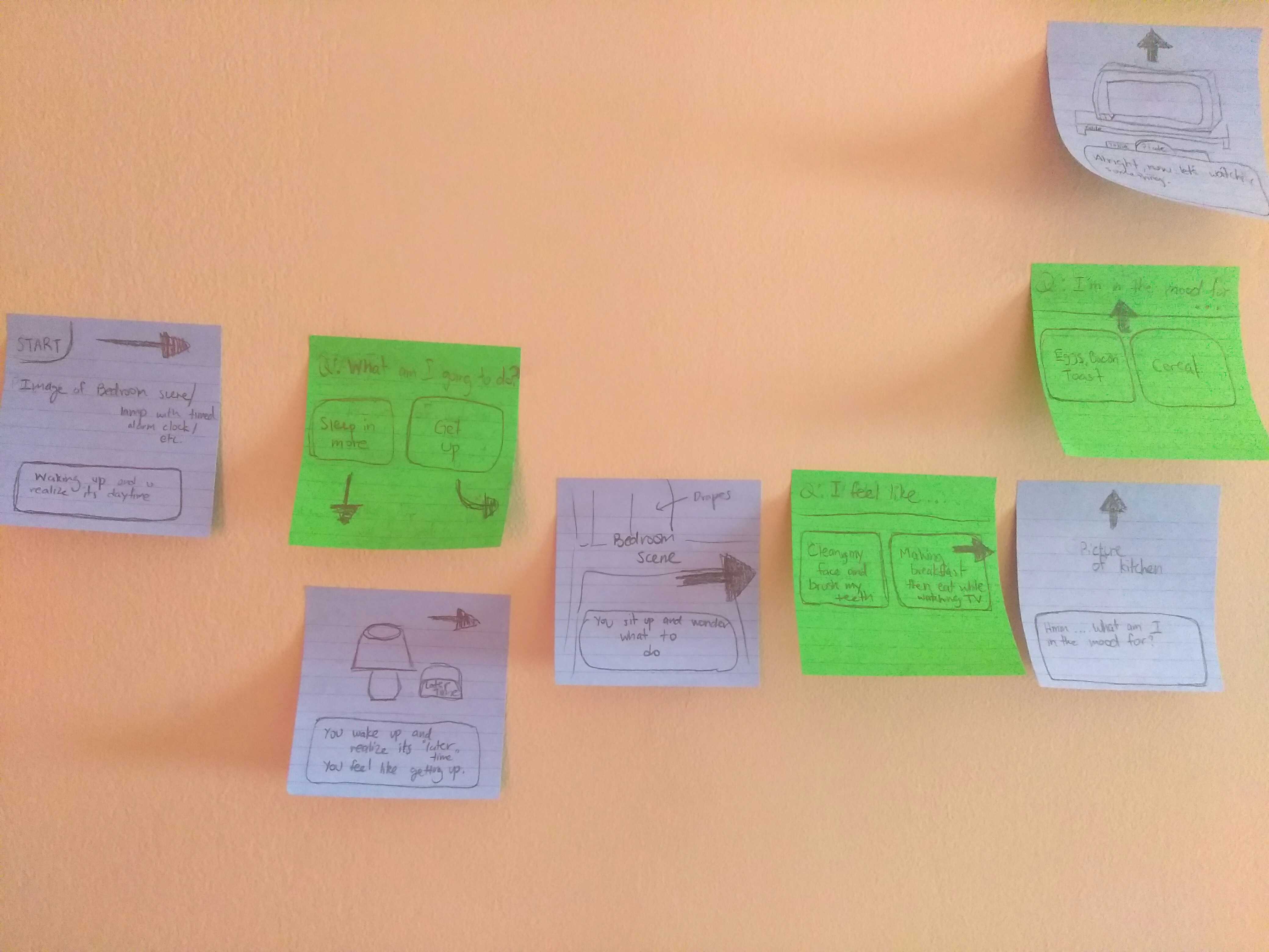
The image above is a part of the storyboard used to make the game. This was used to list out all the possible paths the user can take in the story. This was one of the difficult parts of this project because there are many paths that I had keep track of. Another part that was difficult was learning how to code with html and css in order to get the functionality I wanted in the game.
Take a quick look at some of the progress at the link "Progress Preview" below.
Progress PreviewProject 1: Ipsum Lorem
Add a short description here. Lorem ipsum dolor sit amet, consectetur adipiscing elit. Praesent ex magna, blandit nec viverra faucibus, placerat convallis ipsum. Cras semper ipsum eget ullamcorper ultricies. Curabitur sit amet justo eu sapien molestie bibendum id in enim. Integer semper risus eget nibh eleifend, at vulputate risus laoreet.