December 6, 2019
Project 4: Music Timeline
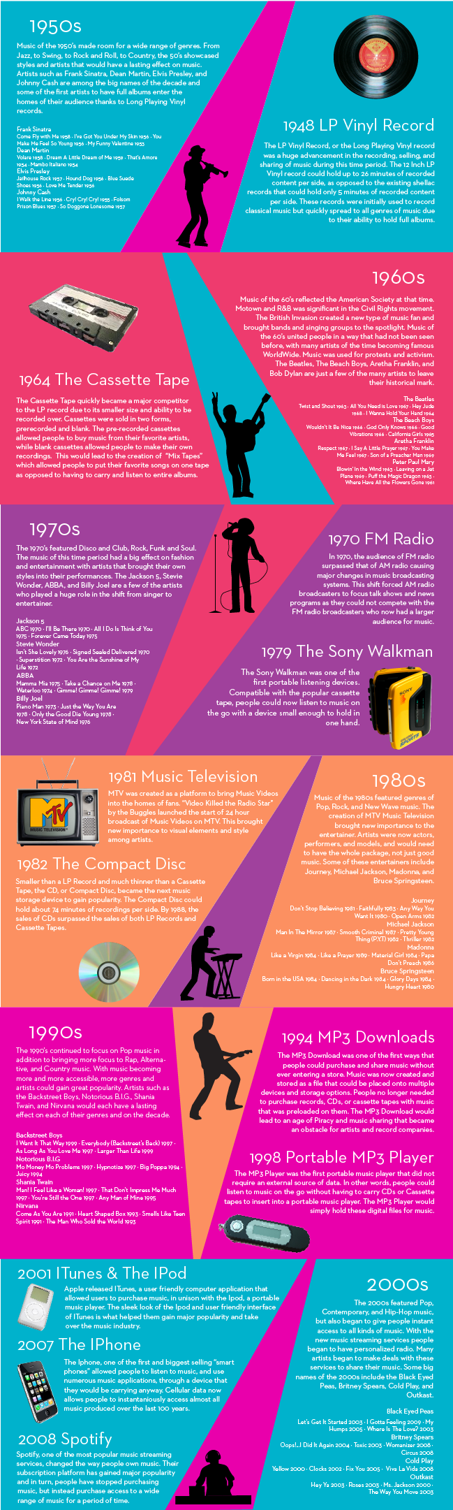
For this project I decided to do a timeline of music by decade. I was mostly interested in how people listened to and got access to music as it is something that has changed greatly. I started by doing research on different music playing devices, storage platforms, and services. I chose to include silhouettes and descriptions of the genres played throughout each decade, as well as big name artists. For my color scheme I wanted to use colors that popped. I also thought it was important to represent that the music and technology of each decade stemmed from the previous decade, making them all connected to each other. To illustrate this I brought a band of color into each decade using the background color of the previous decade. Finally, I used real images of the music devices to show how much music storage has changed over the last 50 years from the LP Vinyl Record, to the Iphone.
October 30, 2019
Project 3: Article 3 Process
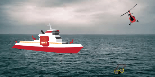
My mom’s brother was a member of Rescue 2, a special unit in the FDNY. This article discusses the day of his death, as he passed away while doing Scuba training on the job. For all three article illustrations, I used photographic images for the backgrounds, while laying my own illustrator graphics over them. For the helicopter and the goggles, I used Gaussian Blur to show depth and disfigure my illustrations as both objects are affected by fog or water. Throughout all 3 illustrations I used colors that are important to the FDNY/firemen.
October 30, 2019
Project 3: Article 2 Process
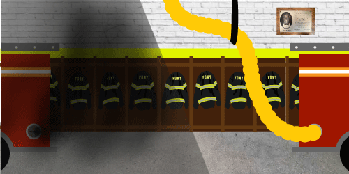
I felt that this illustration should focus on change as my Grandpa fought to make great changes within the FDNY. Specifically, he fought for new gear and the implementation of an exhaust removal system for every firehouse. The exhaust from the firetrucks is extremely harmful, and can cause lung cancer, which is what my Grandpa passed away from. This is why I chose to use a split frame and show a firehouse before and after these systems were implemented, while featuring the plaque of my Grandpa which now hangs in every NYC firehouse. To construct the smoke/exhaust I learned how to create new brushes and used Gaussian Blur.
October 30, 2019
Project 3: Article 1 Process
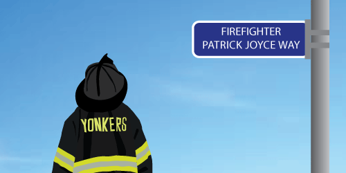
The day we started this project happened to be the 10 year anniversary of the death of a close family friend, Patrick Joyce. Pat was a fireman who tragically died in the line of duty. This year to commemorate his death and legacy that he left behind, a street was named after him. This inspired me to focus on articles that featured some members of my family, and the sacrifices they made as firemen, to show that their legacies live on.
October 2, 2019
Project 2: Icon 3 Process
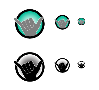
To construct this icon, and used the same process I did for icons 1 and 2. In the end, all 3 icons were created by placing a graphic over a teal circle with a thick black stroke. Each graphic used a gray fill with thin white, rounded strokes. These aspects helped to make all of the icons uniform and true to me.
October 2, 2019
Project 2: Icon 3
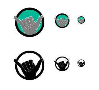
For icon 3, I decided to use another object specific to me, a keychain that my mom gave me. The keychain is a hand that has bendable fingers, and everyone who knows me knows what my keys looks like. I chose to have the hand make the Shaka sign, as my brothers and I used to use the sign as a handshake when I was a kid. Additionally, I feel that this symbol shows my laid back personality, and even my love for the beach.
October 2, 2019
Project 2: Icon 2 Process
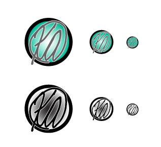
I worked on my icons by switching back and forth between ideas. For this icon I also played with gradients and colors as I had not finalized my design for the first icon. Ultimately, this icon had issues with gradients similar to icon 1, and I decided to get rid of them completely.
October 2, 2019
Project 2: Icon 2
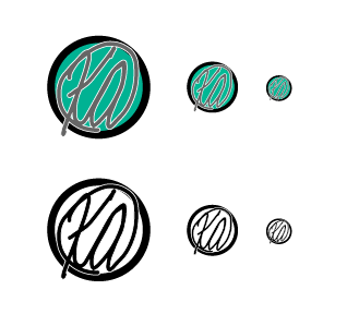
After finishing my first icon, my second icon came pretty easily. I decided to use the same color scheme, circular shape, and similar strokes for my second icon, which is my signature laid over a circle. I felt that this was a good icon for me as I have been using this signature to sign all of my art work since about 6th grade.
October 2, 2019
Project 2: Icon 1 Process
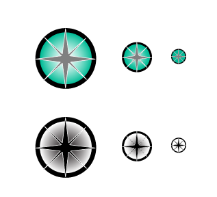
Once I had an idea for the first icon, I created some sketches. My first sketches combined my signature with a compass. However, this seemed too complex for an icon so I decided to separate these aspects into 2, giving me the idea for my second icon, which focuses on my artistic signature. Once my idea was simplified, I moved to the computer. I worked on the largest icon first. I used a gradient to make the compass hands pop more. However, when I moved to the smaller sizes I realized that this would not work well. I decided to play with the intensity of the gradient based on the size of the icon, with a heavy gradient in the largest icon to no gradient in the smallest icon. This was more effective than having the same gradient for all 3 sizes, but ultimately I decided just to lose the gradient completely for a simple and bold look.
October 2, 2019
Project 2: Icon 1
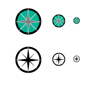
I had a difficult time coming up with ideas for my icons at first as I wanted to come up with a concept that really showed people something about me. For the first icon I decided to represent the necklace that I wear everyday, a compass necklace. I like the compass as an icon because it represents how adventurous I am, and how much I like to travel; but also how I always return to my home, New York.
August 28, 2019
Project 1: Process
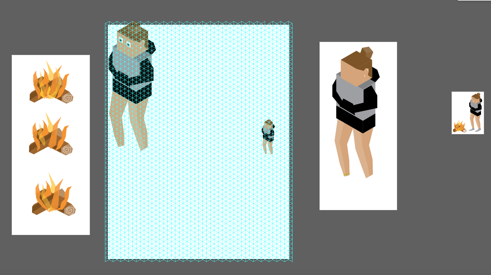
To create this avatar, I stuck very closely to the isometric grid. I began by constructing the basic block shapes that make up the head and torso of the avatar. As I moved along, I strayed from the grid to give my avatar a little more shape. I worked across multiple artboards to get a better visual of my work and to try different things. Finally, I scaled all of my final pieces to fit on a 2 inch tall artboard.
August 28, 2019
Project 1: Isometric Avatar
![]()
For this project I began by researching different isometric avatars. I really liked the ones that emphasized the square shapes and stuck to the isometric grid. I decided to use this idea and designed my avatar based on what I was wearing that day. By taking on this block like shape I was able to use the isometric grid to my advantage. Once the shapes were made I used different opacities to create a feeling of depth through shadows of colors. Finally, I added the fun element of a fire to complete the "summer night" version of my-avatar-self.