December 15, 2019
Board Game Project
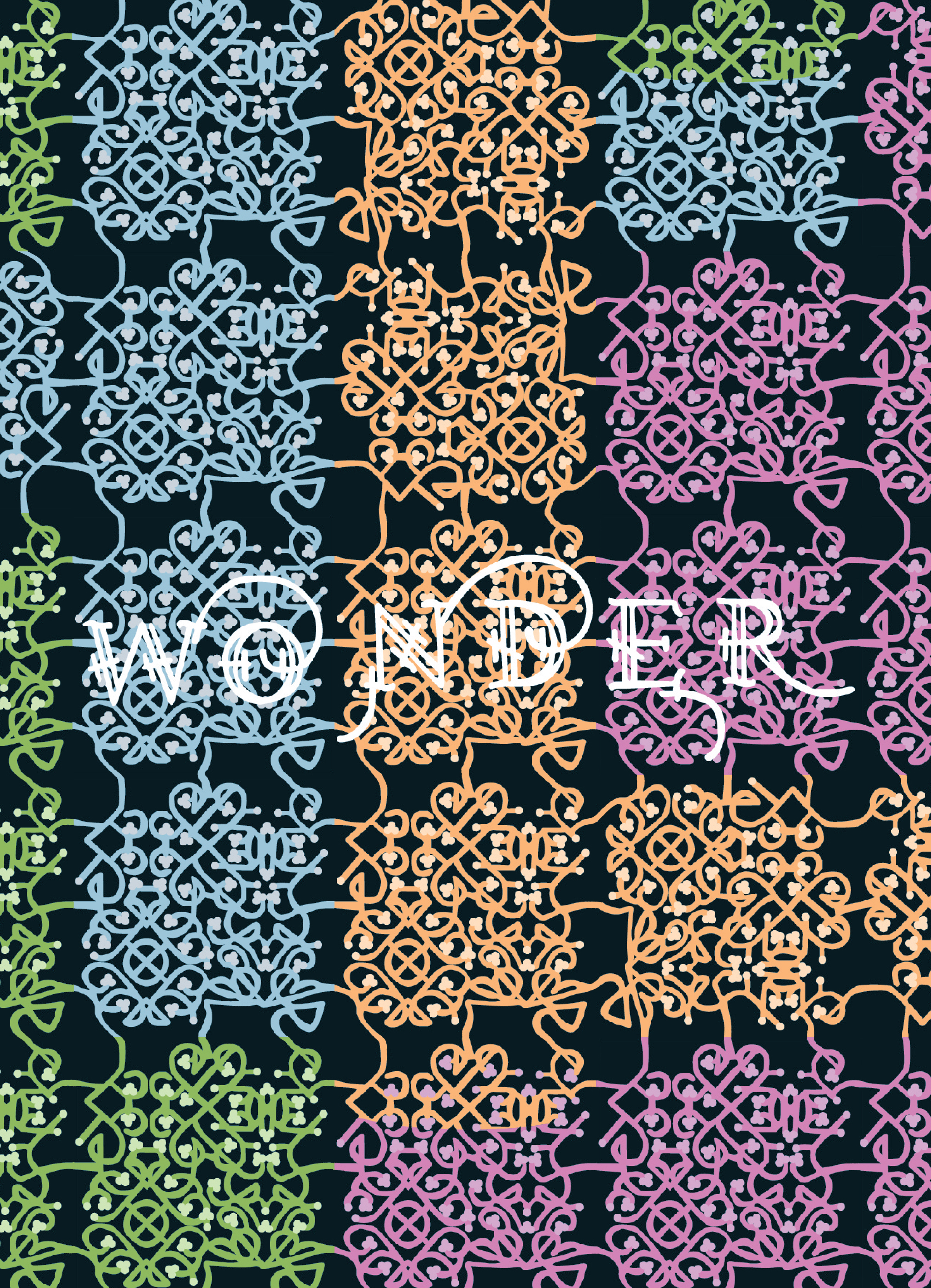
This was a project I did for my Graphic Design II class. We picked a designer and then created our own board game, card game, or video game to go with that designer. The designer I chose was Marian Bantjes because I really liked all the different patterns she creates.
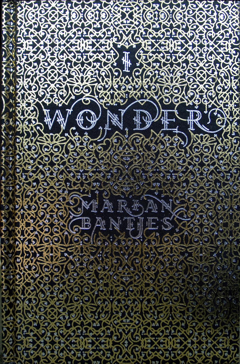
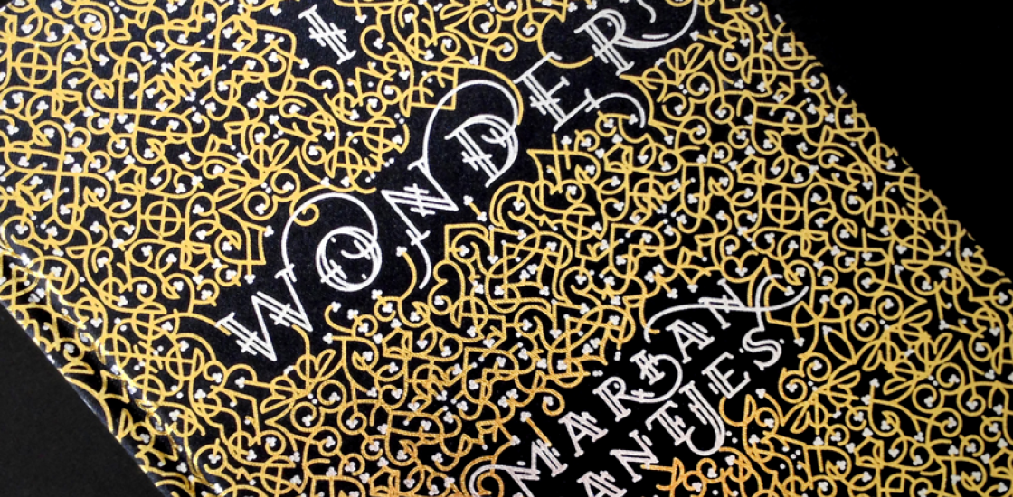
Marian Bantjes
She was born in 1963. She started studying art in 1982 but dropped out of school before getting her degree. She is a graphic designer, typographer, writer and illustrator based in Canada. She is also a member of Alliance Graphique Internationale. She used to be a book typesetter with Hartley & Marks before she founded and ran a graphic design studio Digitopolis. Since 2003, she has worked for herself as a designer and an artist. She became famous for her lettering. She wrote a book that was published in 2010 called I Wonder which explores the relationship between words and images. Her work has been published in books and magazines worldwide such as STEP, Azure, Matrix (Quebec), and Tupigrafia (Brazil). She has also won many awards and her clients include The New York Times, Pentagram, Saks Fifth Avenue, Print Magazine, The Guardian (UK), WIRED and others.
Inspiration
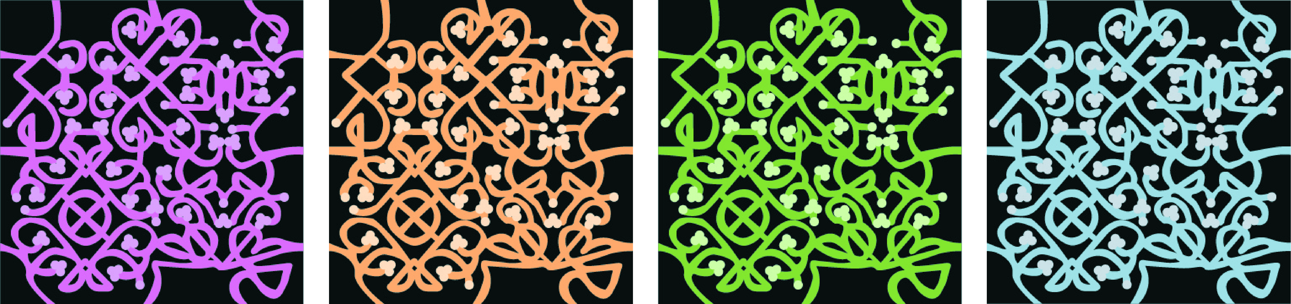
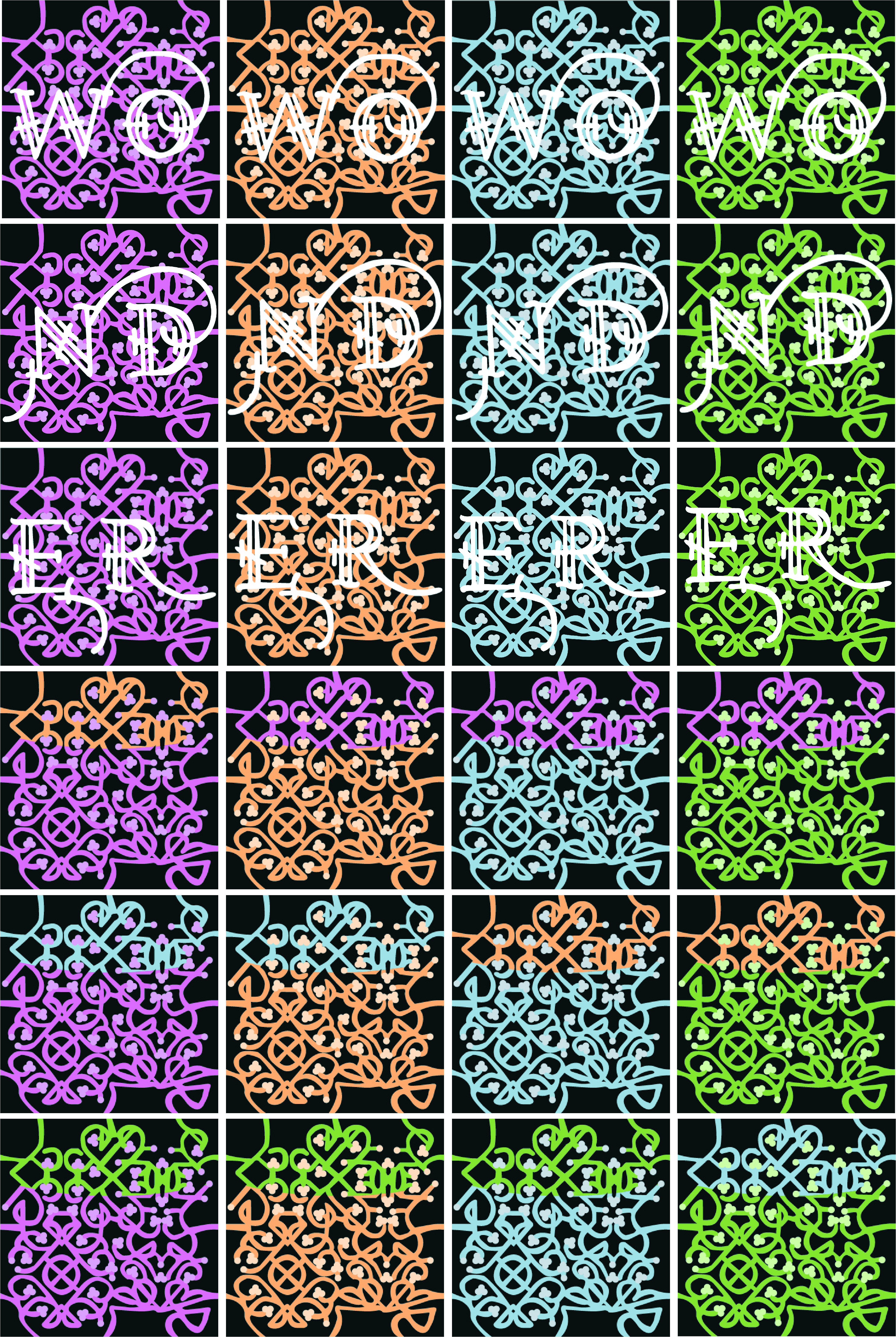
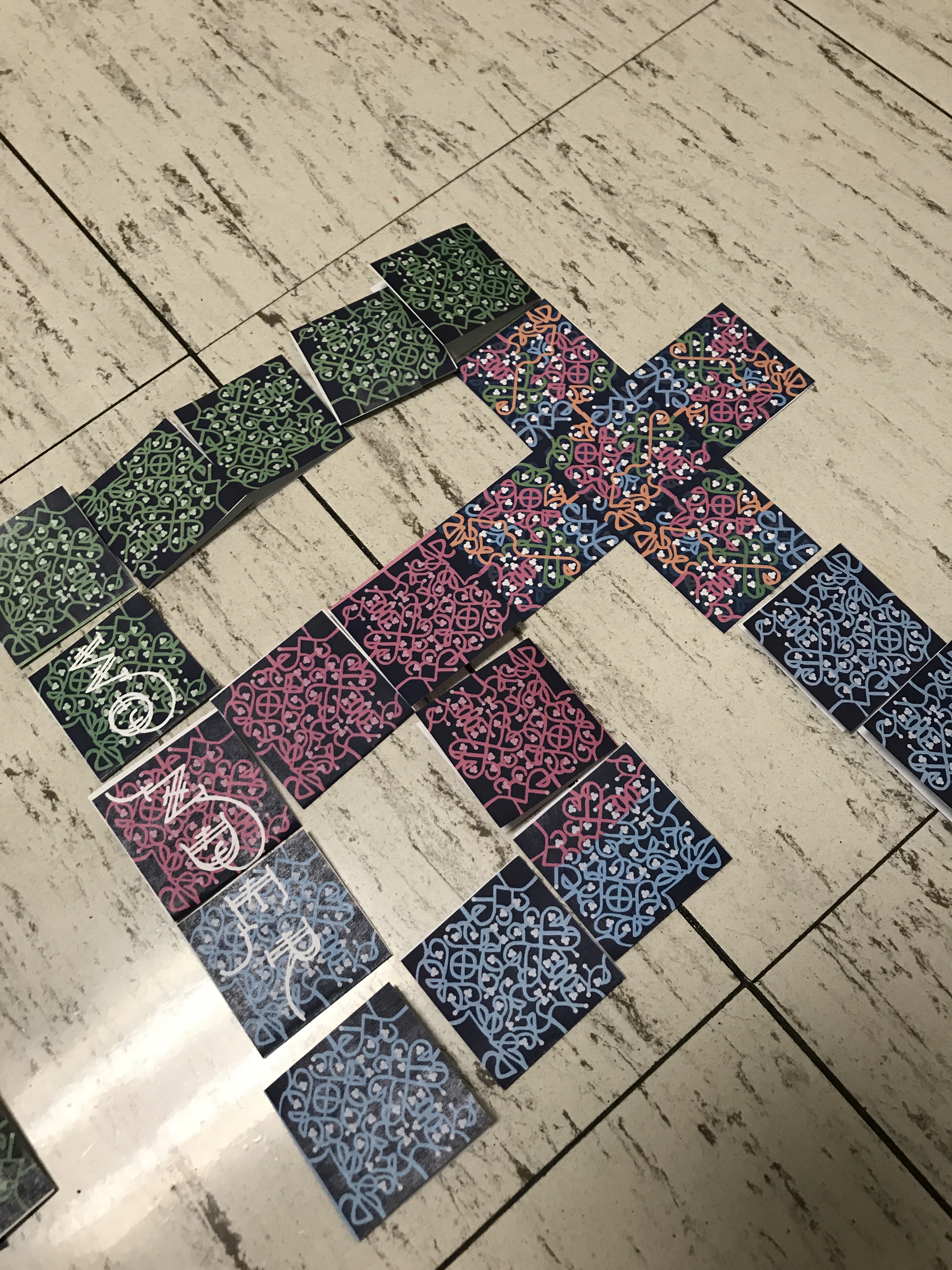
The board game pieces
Board Game Box
Basic Rules to Wonder: The Board Game
Game Objective
The main objective of this game is to create a unique pattern with your family and/or friends! However, while cooperative, it is also competitive. You will compete to get the most points by the end of the game. Players do this by creating words, worth 2 points each, placing End Tiles, 1 point per tile, and creating the longest consecutive pattern of the same color.
Set Up and Starting:
Pick a color - Pink, Orange, Blue or Green - and claim your tiles. Each player will have 30 Pattern Tiles, 30 Letter Tiles and 20 End Tiles. Next, sort your tiles into two piles: one small pile and one large tile. The small pile will consist of only End Tiles which you will leave face up. The large pile will be both your Pattern Tiles and Letter Tiles which will remain face down for the entirety of the game.
Place the Starting Tile in the middle of the playing area. Each player will then place one of their Pattern Tiles at each end of the Starting Tile. Next, everyone pick three tiles from the larger pile of tiles; this will be your ‘hand.’ Important: each player must start out with at least one Pattern Tile, so, if you pick all Letter Tiles, discard one and pick up tiles until you get a Pattern Tile.
How to Win!
Once the game is over everyone must carefully count their tiles. 3 points is awarded to the player with the longest consecutive pattern. Each player gets 2 points per word. Each player gets 1 point per End Tile played.
About the Tiles
Pattern Tiles are the ones with only the patterns on them. Each player has 30 Pattern Tiles that can only be placed if they connect to the same color.
Letter Tiles have the pattern as well as two letters on them. Each player has 30 of these tiles as well. You can place them like Pattern Tiles, however, others are able to add onto the word you are trying to create. They are only able to do so if their pattern reaches where you played the Letter Tiles. Whoever finishes the word gets the points.
End Tiles are the ones that have two colors on them: the Tile Player's color which is the largest swatch of color, and the Ending Color, which is the color of whatever pattern the Tile Player is playing the tile on.
Gameplay:
The player with the next birthday goes first. On your turn, you have 2 options. You can place 2 tiles then pick 2 tiles from your large pile. Or you can place an End Tile.
Placing a tile means it is touching a tile you have previously placed. You can place a tile along any section of your pattern.
If you want to place an End Tile, you can’t place or pick up any other tiles. When you play an End Tile, you will decide which player’s pattern you’d like to stop and then play the tile that has that player’s bit of color on it.
Game-End Conditions:
The game ends when two or more players are out of End Tiles, or if one person uses all of their Pattern and Letter Tiles.
Example Board:
December 15, 2019
Icon Examples
These are some icons I created in my very first college Software class.
December 6, 2019
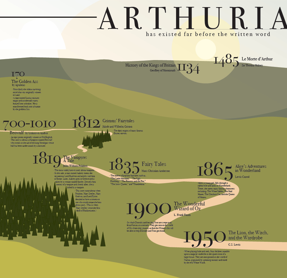
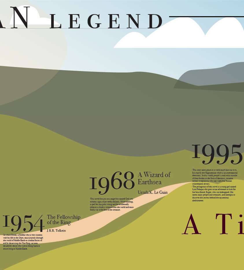
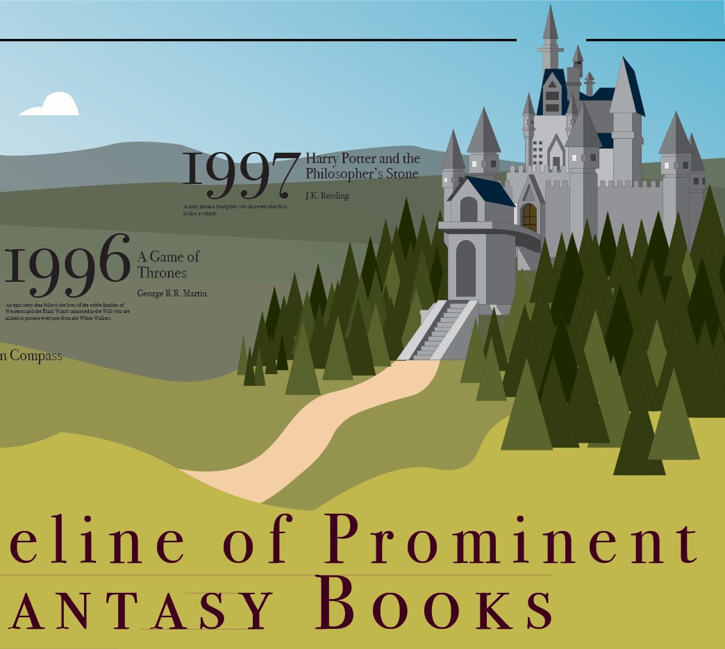
Software II Project 4: Timeline
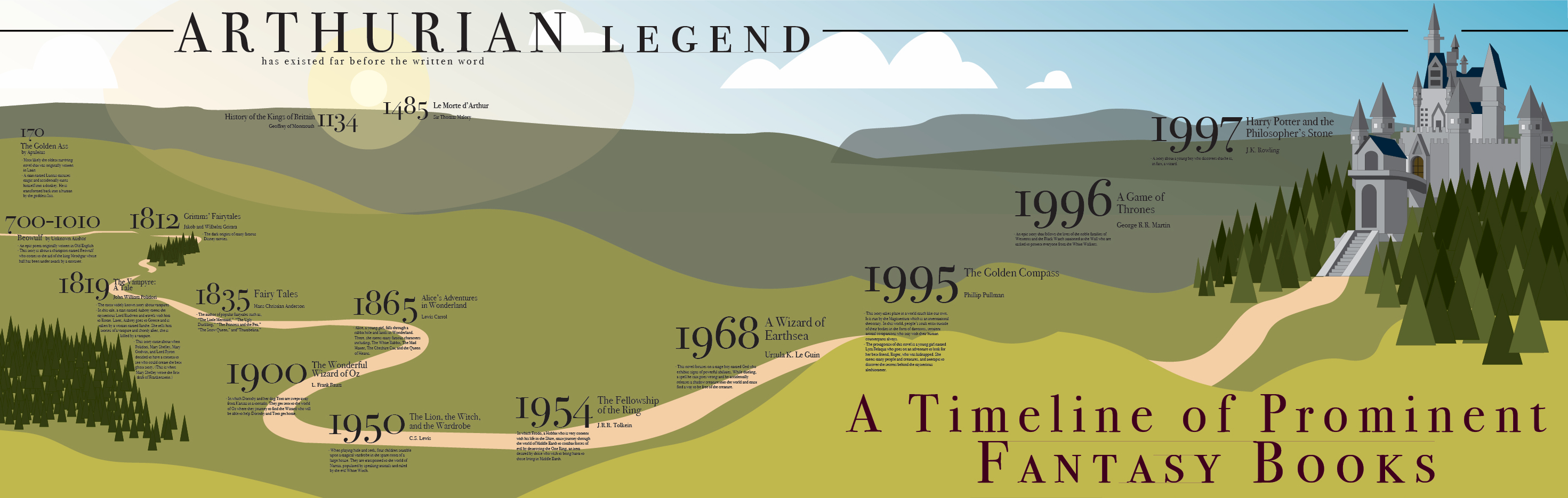
For this project, we had to create a timeline for anything we wanted. As an avid reader, I knew right away that I wanted to make a timeline for fantasy books. I first created a list of prominent fantasy books written throughout history and then narrowed it down, which was very difficult to do. The main problem I had with this was coming up with a design for the timeline. I tried two different things which I really did not like, and finally decided to create a castle in Adobe Illustrator which then led to the current design which I am very happy with!
November 4, 2019
Software II Project 3: Article Illustrations:
For my three articles, I knew before I started looking for them that I wanted to use articles that had to do with issues I am passionate about. I also knew that, for my actual illustrations, I wanted to work with real pictures as well as vector images.
First Article:
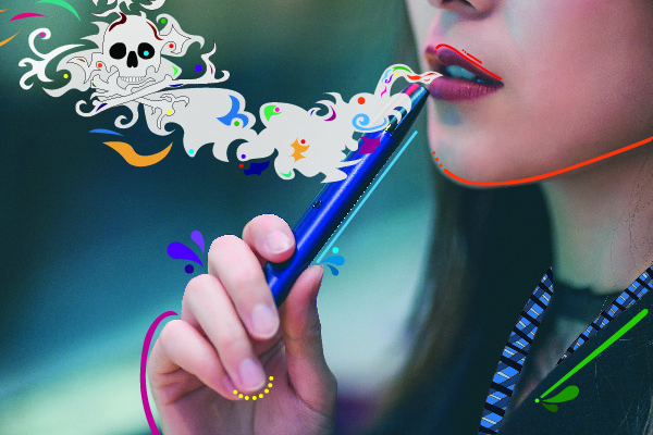
For the first article, I chose one that had to do with the dangers of vaping and how we as a society should be helping young people quit. The article mentions how there is a perception that vaping is safe—atleast safer than cigarettes—so I wanted the illustration to be a little fun and whimsical while also portraying the real danger. To do this, I made the vapor curling and colorful, then incorporated a skull and crossbones that wouldn't be the first thing you notice when you look at the illustration.
As Sea Levels Rise, So Do Ghost Forests
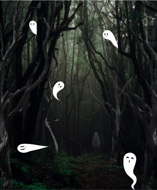
For the second article, I wanted to do something related to climate change and found this article about Ghost Forests. I didn't know anything about Ghost Forests so this article was really informative and also gave me a good idea for an illustration. First, I thought I would try to make a forest growing more and more transparent, but once I started experimenting, I realized it wasn't going to work out well. Instead, I decided to take the name 'Ghost Forest' literally. I chose a photo of a dark wood and added more trees. I made these trees lighter and lowered the opacity so that they would look ghostly. I also added the picture of a girl and did the same thing to it that I did to the trees. To keep the whimsical style, I created some cute ghosts in Illustrator
Third Article:
First All-Female Spacewalk Is Back On, NASA Says
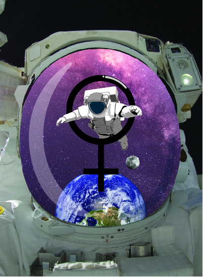
For the last article, I chose one about the all-female spacewalk. They set off on October 21st! The biggest difficulty for this illustration was figuring out how to make the viewer know that the illustration was for an all-female spacewalk. I knew I didn't want to use stereotypical 'female' colors, so, instead, I used the female symbol. I made the symbol and the astronaut in Illustrator and the rest in Photoshop. I decided to position the symbol around the astronaut and have the astronaut almost floating through it to help draw your eye to both.
October 6, 2019
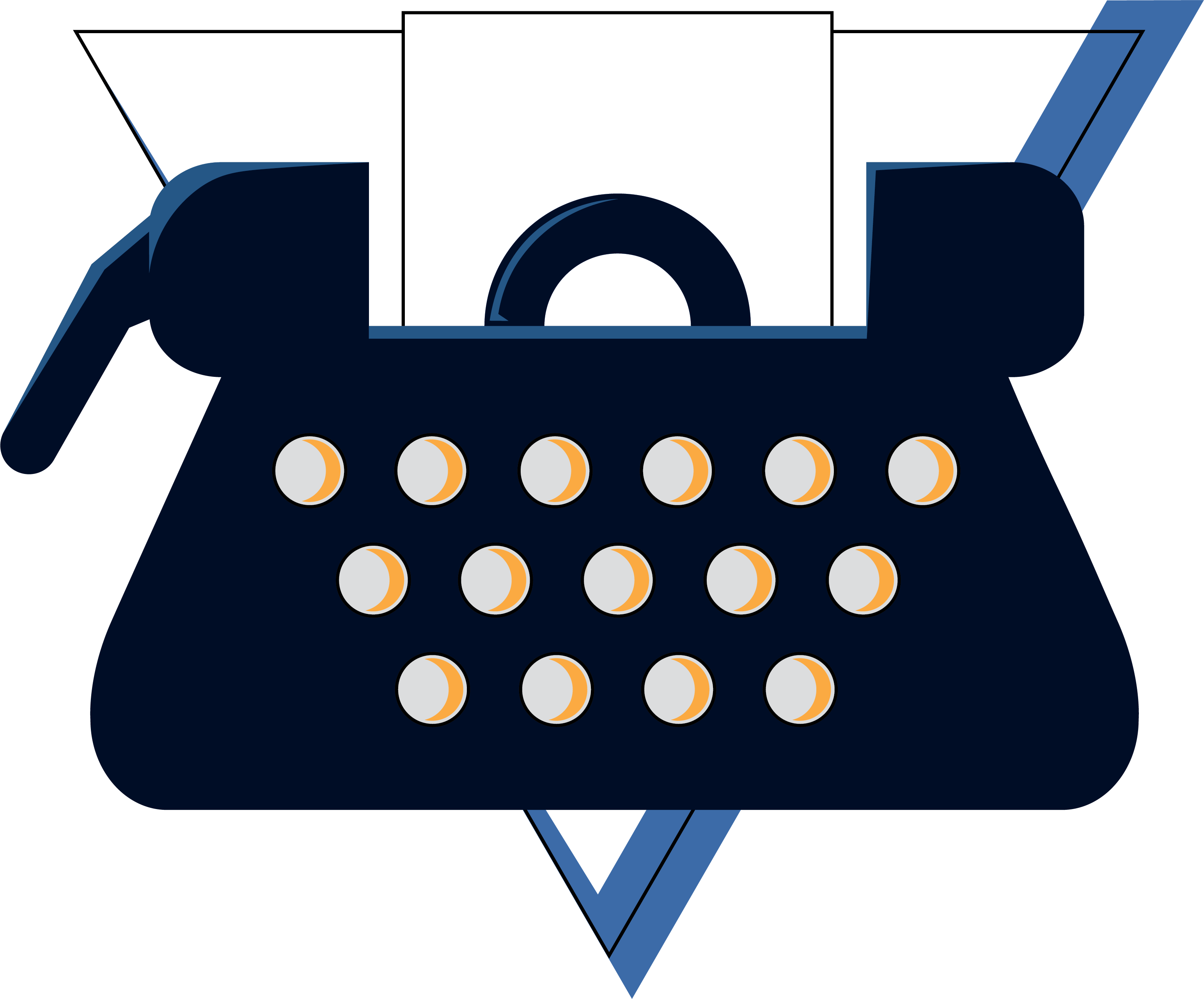
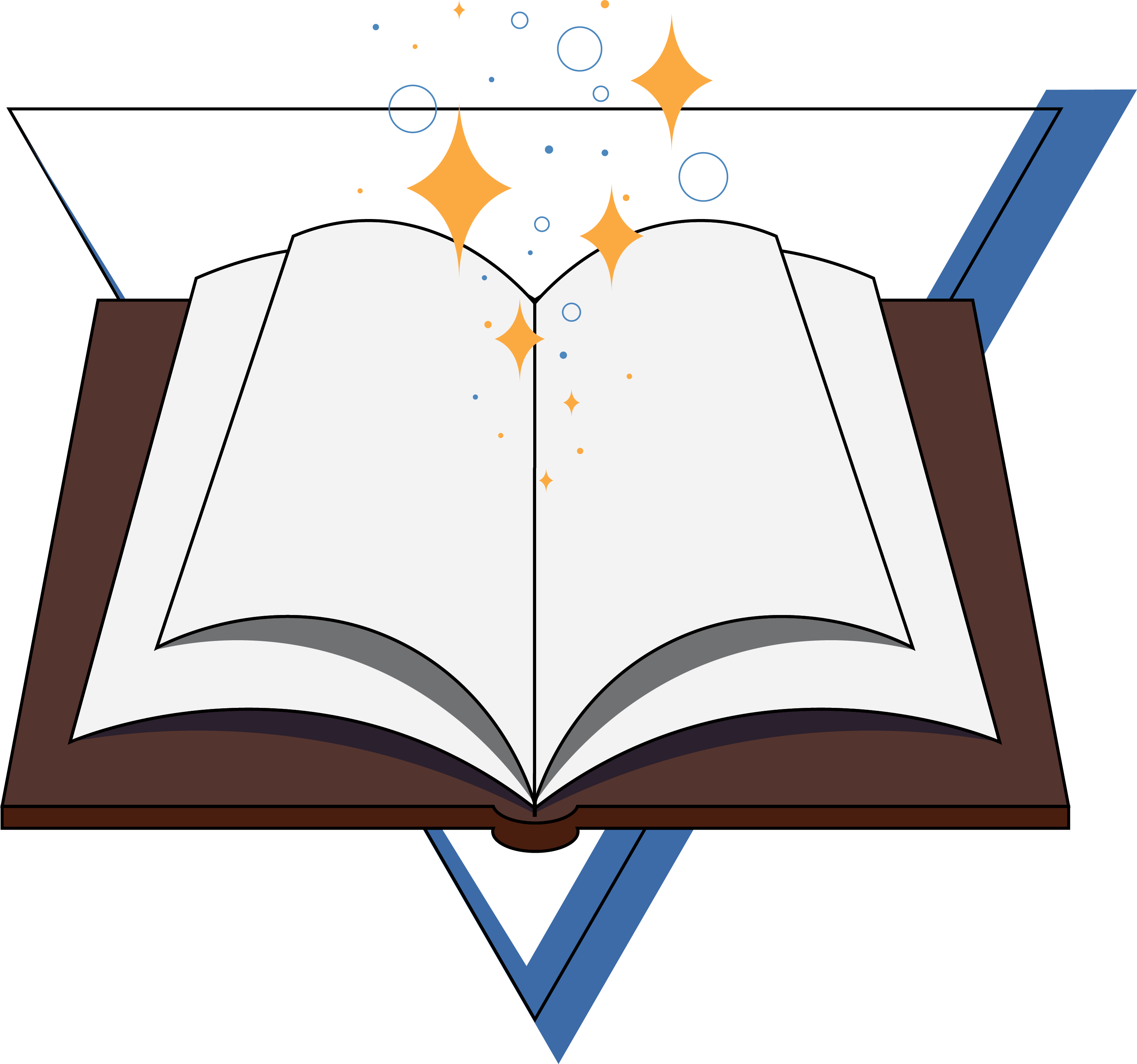
Software II Project 2: Scalable Icons
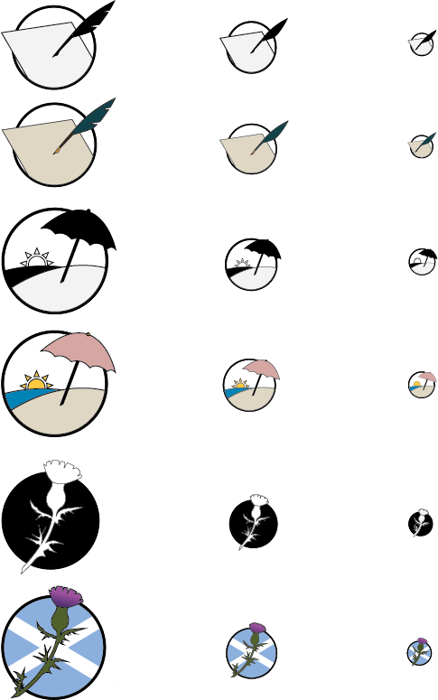
In this project, we focused not only on creating three icons that go together, but also on making icons that would look good scaled very big and very small. We had to make the icons colored and in back and white. For each version, we had to resize and rework each icon to look good in three sizes: 128 pixels, 64 pixels, and 32 pixels. When I was trying to come up with ideas for my icons, I thought about stuff I liked and stuff I enjoyed doing. I also decided to use a circle as my main, unifying shape. And, with that, I came up with the following:
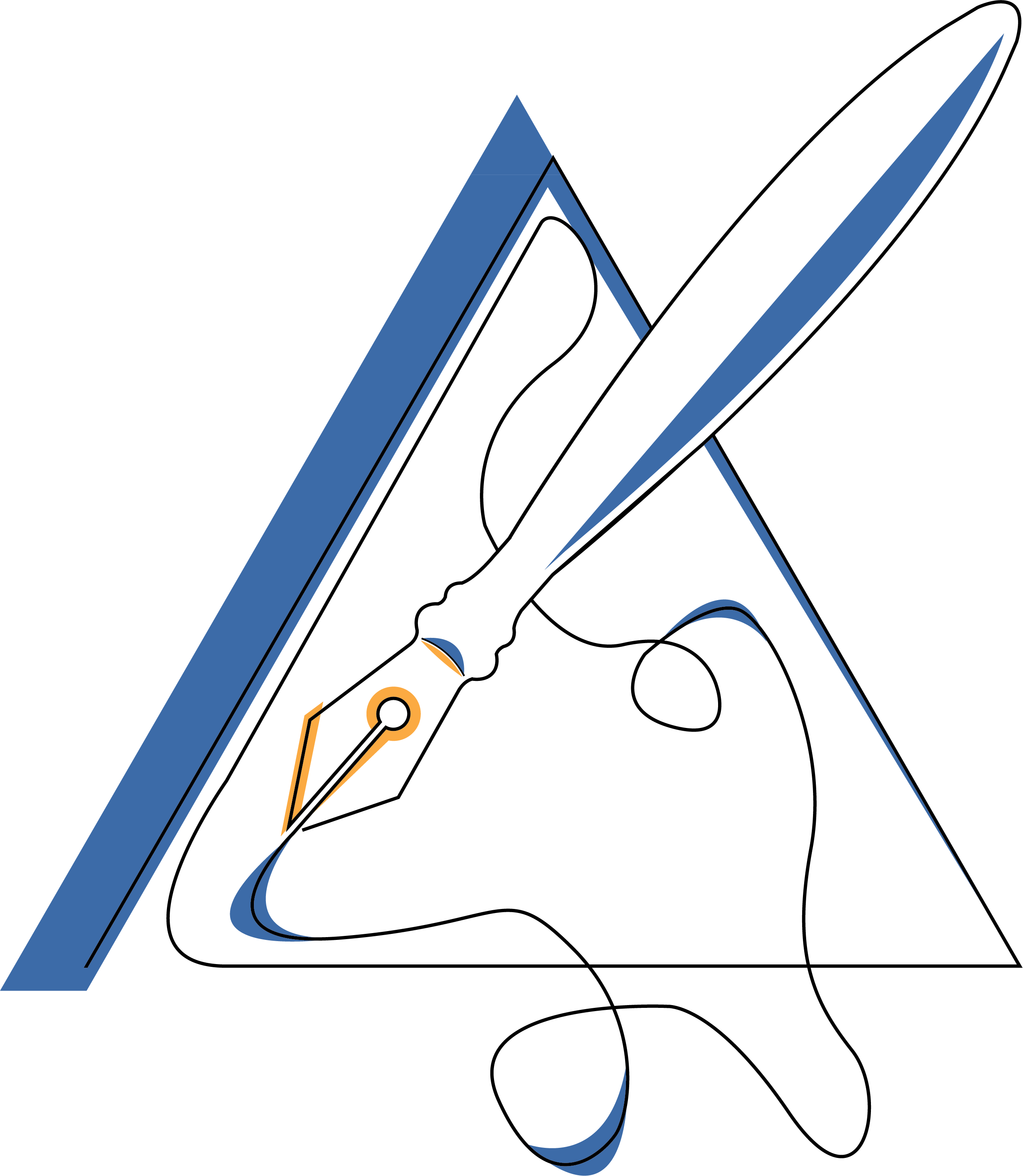
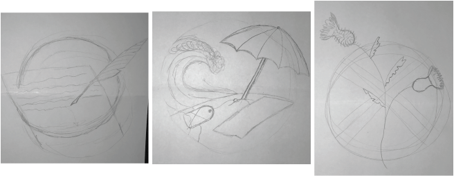
I love writing, so I knew that I wanted to do something with that. I sketched many different writing implements such as a laptop, a typewriter, a notebook, and a hand holding a pen. I decided to go with a quill and paper because I thought it looked elegant and I also really like how the paper and quill could stick out of the circle.
For the next icon, I decided to focus on a place I enjoy going to. Every summer, my family and other families we’re friends with go to the Outer Banks, North Carolina for a week. I always look forward to this trip so I wanted to find a way to represent it for this project. I knew I wanted to include sand, water, the sun, and an umbrella, but I wasn’t sure if I should add anything else. I played around with putting either a chair or a beach towel under the umbrella, however, it began to look too busy. Once I decided on what the components of the icon would be, I had to choose colors for it. I easily found a blue and a sandy color that I liked; the sun would be yellow. But I didn’t know what color to make the umbrella and the sky. For the sky, I thought it would be interesting to leave the space transparent so that it could become any color the icon is in front of. The sky at the beach is always pretty, especially during sunrise and sunset so I thought the dynamic element caused by keeping the ‘sky’ transparent would make the icon better!
My final icon is my favorite. I decided to represent my love of Scotland because I studied abroad there in the fall semester of 2018. The white cross with the blue background is for the Scottish flag. And the thistle is the national flower of Scotland. I found an image online for the flag and used the eyedropper tool to find the correct color blue. However, I thought it wouldn’t let the thistle stand out so I decided to lighten it a little. For the thistle, I found a photograph of one of the plants and used it as a reference when creating the vector image on Illustrator. I also used the eyedropper tool on the photograph of the flower to find the proper pinks and purples.
When it came to making the icons black and white, the only one I struggled with was the thistle. I wanted to keep the cross in the background but only being able to work with two colors meant that some part of the thistle would blend in with the background. So, what I ended up doing was making the background all black and the thistle white with an outline. Though, I still wish there was a way to keep the Scottish flag aspect in this version, I am happy with how it came out!
September 5, 2019
Software II Project 1: Isometric Avatar
![]()
For this first project, I used Adobe Illustrator and an isometric grid to make an avatar of myself. The most challenging part was figuring out how to make the avatar look good while still fitting to the isometric grid. Once I figured that out, I began thinking about the details I wanted my avatar to have. I wanted her to have short hair, like I do currently. I also wanted her to be interacting with something writing-related because writing is one of my passions. I decided to have her leaning on a giant fountain pen and I really like how she came out!