

Project 1: Functional Specification - As We May Rethink
1. Scope: - what are the project goals, deliverables, features, tasks, deadlines and cost?
To create a private file & library with sharing capabilities
Storage of info that can easily be found at a later date
Easily share information between devices/people
Create a comfortable work space
2. Solution Overview - what are you proposing to create to solve a problem?
A device that links information based on how you interact with different sources to make information more manageable and easily recalledphysical description :
large table/desk, U shaped
sleek, shiny, easily cleaned
3 screens that interact with each other, with blue light protectant
pen that allows you to make handwritten notes/drawings
technologies used
display screens
buttons/keyboard
memory devices
levers/dials
interactive “pen” and mouse
3. Requirerments Specification - what does the proposed device do?
Organizes and displays data in a personal, adjustable way
Saves data with notes and associations
4. Use Cases - put functional requirements into the context of a user action.
1. Turn on the device using the power button
2. Adjust the height/angle of screens
3. Insert information/memory device or access information already saved on existing memory device
4. Use pen/mouse to arrange information on screens
5. Make notes/outlines of information, sort by relevance
6. Search for information stored on device that became relevant during your evaluation of info
7. Save new notes and information together on memory device for future use, or to be shared
8. Remove memory device to share or store
5. Non-functional Requirements - any nice to have features that do not effect core functionality
Soft armrests
Adjustable height for standing vs sitting
Black and white vs color function

Project 1: User Flow - As We May Rethink
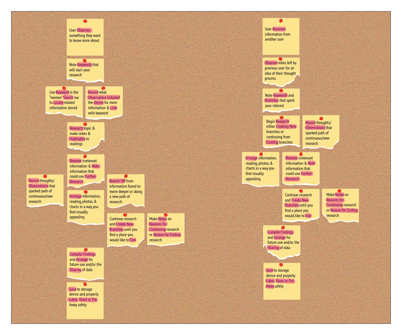
For this project I chose to design the “memex” while focusing on the recalling and sharing of information. For the User flow diagram I decided to have 2 different starting points, one for users who were inspired to research based off of an observation or experience they had, and one for users who were inspired by the research of others. The steps I included demonstrate the importance of recording observations, information, and process. For my user flow I chose to have a style resembling a bulletin board and post-it notes for 2 reasons. Personally, I found that physically arranging post-its with steps was what helped me to understand the user flow and this assignment so I thought it would be nice to mirror my actual process. Secondly, the “memex” was a concept discussed prior to the modern computer and I wanted to preserve some aspects of its age. Additionally, although I arranged the user flow in a way that I found to be most effective, the idea of post its pinned to a bulletin board demonstrates that steps can ultimately be rearranged based on user preferences and new discoveries.

Project 1: Device Design Illustration - As We May Rethink
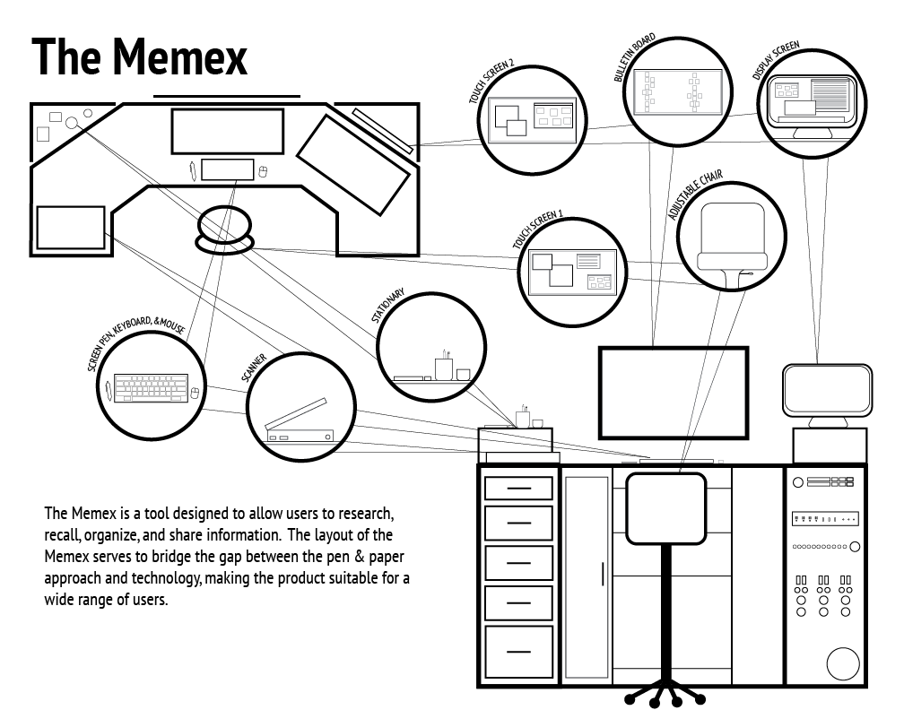
I chose to show 2 views of the Memex and zoom in on important aspects of the interface. I chose a very simplistic design that I think enhances the many features that make the Memex such a useful product.

Project 1: Magazine Ad Design - As We May Rethink
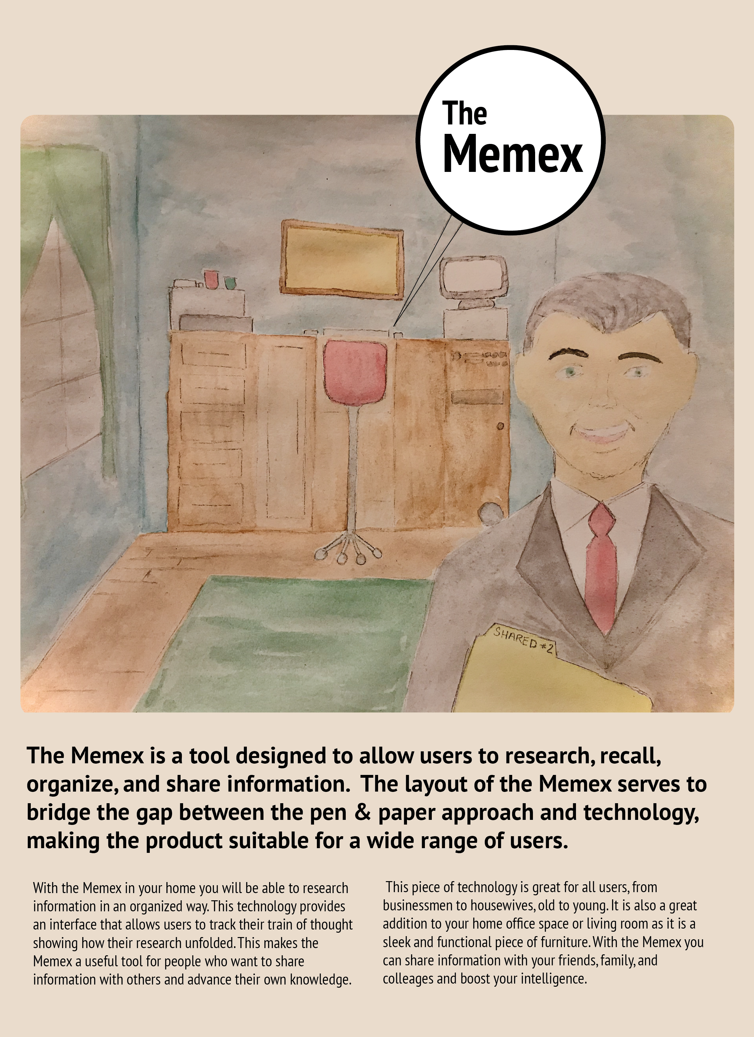
For this Advertisement I wanted to have the design fit the time period. To accomplish this I tried to illustrate a 1950s home, using muted colors. Additionally, I used the traditional 2/3rds layout with divided text and image.

Project 2: Planning Stage - Transcoding Data
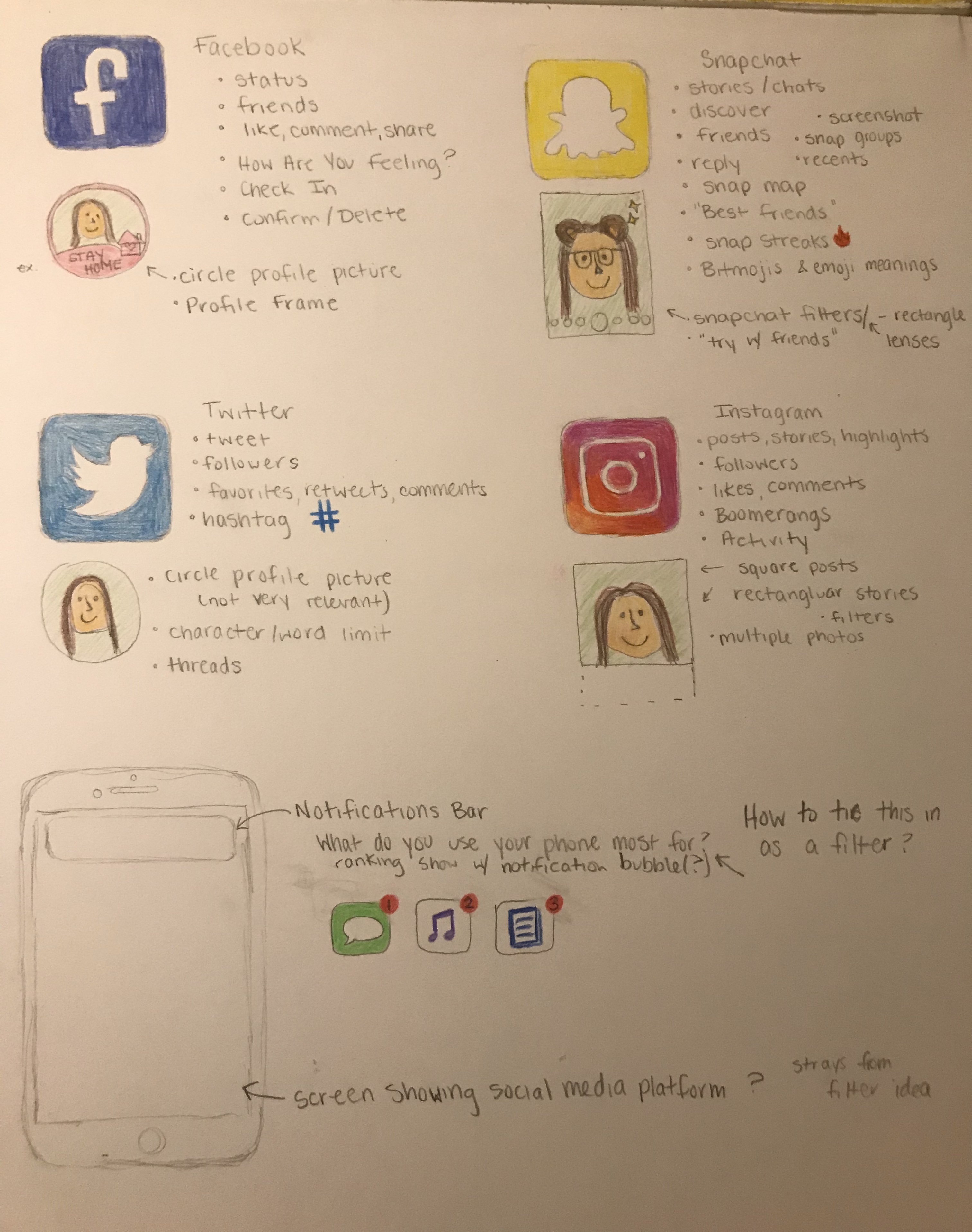
With the focus of my project being social media, I started by researching the different social media platforms.

Project 2: Process - Transcoding Data
Process & KeyAfter getting a better understanding of the project, I moved away from my initial research and more towards an abstract design. I combined the elements to create a social media filter. I wanted to do this so that participants would have something to take with them at the end of the survey that they could potentially use on social media.